Interviews & Profiles
Steve Romalewski wants to help you understand redistricting
The CUNY researcher’s project “Redistricting and You” translates the complexities of redistricting into easy-to-read interactive maps.
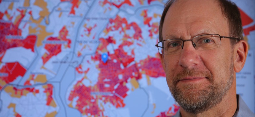
Steve Romalewski helps coordinate the “Redistricting & You” interactive mapping project at CUNY’s Center for Urban Research. Ozier Muhammad/City University of New York
On Feb. 28, Gov. Kathy Hochul signed new congressional districts into law, finally bringing New York state’s years-long redistricting to an end. The congressional boundaries drawn this year – which differ little from those drawn by a court-appointed expert in 2023, with the exception of a few upstate districts – will remain in effect until 2032. The new lines drawn are expected to impact political representation and voter demographics in the upcoming years.
Steven Romalewski, researcher at The Center for Urban Research at the CUNY Graduate Center, is part of the team behind “Redistricting and You,” an interactive mapping project that provides members of the public with easy-to-read maps showing the state’s old and new district boundaries.
City & State caught up with Romalewski to discuss the “Redistricting and You” project and why redistricting matters.
This interview has been edited for length and clarity.
What’s the idea behind the “Redistricting and You” site?
My team at the City University of New York Graduate Center is part of the Center for Urban Research. The center does research and examines all sorts of demographic changes and patterns in urban settings, mainly in New York, but other cities as well. We're very interested in understanding how people find themselves, how they're represented, and how they participate politically. So we do a lot of maps of election results. We keep track of all of the legislative district boundaries because that's one way that people organize themselves.
One expertise that we have is to develop interactive mapping applications, so people can visualize interesting data for a variety of different purposes. We were very involved in the 2010 census, in which we helped provide maps for stakeholder groups across the country so that you could see where hard-to-count communities were located, so they could prioritize their outreach and education to get people to participate in the census. After that, you know, redistricting is the first major use of census data. And so we thought, ‘Well, how can we be helpful in the understanding of redistricting?’
Redistricting is all about drawing maps, drawing new boundary lines based on census data. A number of other organizations were doing that kind of map drawing already, and they were doing a really very good job of it. We talked to the various stakeholders, and they said it would be helpful if you could set up a way for people to easily find out what their current districts look like – because a lot of people might not know – and how those districts might change.
Who is your intended audience?
We decided to name the project “Redistricting and You” because the audience for our mapping website was for different types of people. One group would be people that may not even know that redistricting is happening. Or they might think, ‘Oh, it's this backroom thing, it's politics, and I don't want to get involved.’ Redistricting affects everyone, whether you like it or not. This would be an easy way for you to see what it might mean for you. You type in your address or you click on the map, and you see what the district looks like now and how it might change. You can then evaluate whether you want to get involved or whether you want to learn more about what's happening.
People use it a lot. I was on NY1 almost weekly talking with Errol Louis about redistricting proposals. We were referenced in the New York Times editorial about it. And so after the 2020 census, we were also very involved with helping groups around the country understand where they should focus their outreach and education. That's what the current Redistricting and You website is all about.
What is the purpose behind the design of the site?
We wanted to design a site that you could easily use and would reflect the data behind redistricting without necessarily making you get bogged down in the data. If you're trying to draw a map of your community, or how you think your committee should represent in Congress (or) in the Legislature, it can get bogged down pretty quickly. That is because there's a lot of data to use and a lot of criteria you have to follow.
There are people that get really excited about drawing those kinds of maps and getting deep into the data. But for a lot of people, that's not the case. We wanted to design something that was for them: easy to use and where they didn't have to get mired in all of the data. They could see the data if they wanted to. They can see what the population changes would be and what the voting patterns would be – but it’s mainly so they could see what their district looks like and how it would change. That's why we have the kind of left-right framework on the website, where the district on the right is generally about new districts and the information on the left is about the current districts.
What do you think about the newly-enacted redistricting map?
When the current congressional districts were drawn, there was a whole lawsuit that was brought. The new process with this so-called Independent Redistricting Commission, they couldn't come to agreement. The Legislature decided to step in and draw a congressional district plan and also a state (senate) and Assembly district plan. People sued and said that it was not right in process and argued that the congressional lines the legislature drew were partisan gerrymandering – they were designed to help one party over another.
The Court of Appeals agreed that the process was not followed. It was unconstitutional because of the issue of gerrymandering. A special master was appointed by the court to draw a congressional district plan. (The governor and the state Legislature) complained heavily that the special master shouldn't have done this. Another lawsuit was brought that enabled the Legislature to get back into it, and they drew the lines that we now have for the current election.
But the interesting thing about the lines that the Legislature drew and the governor (signed) into law, is that they're very similar in most places of the state to what the special master drew. Most of the New York City districts are the same. A couple of the Long Island districts are the same. And some of the upstate lines are the same. It's interesting to me that there were so many complaints about what the special master drew. But then the Legislature decided to draw lines that were very similar. A lot of the New York City districts that people complained about, especially that the special master drew, more or less were untouched.
Do you think redistricting in New York state is broken?
We did have this reform of the process that was established in 2014 where the voters approved this constitutional amendment, and that's what set up the process that we've been following for the past couple of years. The way the reform was designed was designed to fail or not well thought out at the very least.
There needs to be some new reform. I don't know exactly what that is. There are organizations, government groups and others that are paying very close attention to that. I think the Legislature itself agrees that the process that was used doesn't really work, and that there needs to be something better. That's something to keep an eye on because if we ended up with the same process after the 2030 census, chances are it's going to be just as much of a mess then as it has been for the last couple of years. And I don't think anyone wants that.
Correction: A previous version of this article misspelled the name of NY1 anchor Errol Louis.
NEXT STORY: All the ways New York is honoring Flaco in death