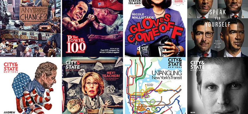
The best City & State covers of 2017
City and State 2017 covers City & State


“To give an overall thought about the 2017 covers, I think it’s a pretty good year,” City & State Creative Director Guillaume Federighi said. He and his design team help draw readers into the magazine, which was a little easier this year. In general, people have been more interested in politics since the 2016 election, Federighi said, “So I think it worked in both ways, where we expanded our horizons, and also I think readers and viewers are more concerned and more aware and educated of what’s going on.”
RELATED: City & State's best stories of 2017
Jan. 16

Creative direction and graphic design: Guillaume Federighi
“This cover got a lot of attention from our readers and beyond on social media. It was during the protests right after Trump was elected. … We thought the subway would be the best medium to make the voices of New Yorkers heard.”
Feb. 13

Creative direction and illustration: Guillaume Federighi
“I drew it myself. … It showed how de Blasio was so delusional, in a way, and had his own way of seeing the city and pretending everything was working well when actually it wasn’t. It’s actually an homage to comic book artist Robert Crumb. … He’s an inspiration.”
Feb. 20

Creative direction and photography: Guillaume Federighi
“2017 was really about having more portraits on the cover. … So we started with (state Comptroller Thomas) DiNapoli. That turned out very well. That was by (photographer) Celeste Sloman, that one set the tone. And then Carl Heastie. I shot Carl Heastie, so I’m very proud of it, because I don’t really specialize in photography.”
March 13

Creative direction: Guillaume Federighi
Illustration: Javier Muñoz Fernández
“Betsy DeVos was really good as the teacher being bullied by the students. Javier has a great style for us because it’s between illustration and photo. It’s all collages. He has a great sense of humor. We come up with concepts, we give him a sketch, usually, but then he has his own tone, and he has a lot of freedom in his creations. … We don’t always just want a portrait, but something that tells more of a story, so he’s the perfect artist for that.”
May 8

Creative direction: Guillaume Federighi
Graphic design: Aaron Aniton
“I liked the collage of New York City about homelessness. It was handmade, we cut out photos with scissors. It was a comparison between the ’80s and today, to see how much the city changed. Has it actually gotten better or not, or stayed the same? So we chose something very raw and just cut out a bunch of images. We pulled a lot of photos from image banks, but we actually shot a few of those homeless people on the street. … The sign was handwritten. We wrote it on cardboard and scanned it.”
RELATED: The biggest Winners & Losers of 2017
May 22

Creative direction: Guillaume Federighi
Illustration: Javier Muñoz Fernández
“Another cover from Javier Muñoz Fernández was President Donald Trump and Gov. Andrew Cuomo arm-wrestling. That was sarcasm, a play on the film ‘Over the Top.’”
July 31

Creative direction: Guillaume Federighi
Graphic design: Aaron Aniton
“The subway situation is terrible in New York these days. I basically took the New York subway map and redrew the lines and made a huge mess, almost like spaghetti, all mixed with each other. … It talks to everyone – larger than just our space. Everybody is concerned about these issues. Anybody who lives in New York has horrible transportation. So it’s a good subject to cover.”
Sept. 18

Creative direction: Guillaume Federighi
Photography: Celeste Sloman
“Malliotakis, that was great. We actually inspired her campaign, apparently (which later ran a TV ad shot in a boxing gym). That was also interesting because it was one of the first shoots where we didn’t just take a portrait, but had the subjects act a certain way to tell the story better. She totally played along.”
Oct. 2

Creative direction: Guillaume Federighi
Photography: Celeste Sloman
“Eric Trump was interesting. We actually shot him in Trump Tower. It was pretty quick. It’s all about time management in their corporation, I guess. We had to go through a process just to get in. We had to get clearance from security. That was pretty unique. For the first shoot, we had like 15 minutes tops.”
Dec. 4

Creative direction: Guillaume Federighi
Photography: Celeste Sloman
Graphic design: Kewen Chen
“The Speak for Yourself cover is a really, really cool cover. The council speaker candidates were all very happy with our photos, which is a good thing for both parties. We have great photos for our covers and they get great photos for marketing, publicity or whatever. That was a really interesting cover, mixing all those faces all together. Creating one person with multiple people, basically, a multifacet person. That was one of the best ones this year for sure.”
Dec. 11

Creative direction: Guillaume Federighi
Illustration: Javier Muñoz Fernández
“I like the last one too, Cuomo as a Republican elephant.”
NEXT STORY: Six things to know about Corey Johnson