Personality
Ruining more iconic NYC logos
It’s not just We ❤️ NYC, there are other perfectly good logos that could use a redesign.
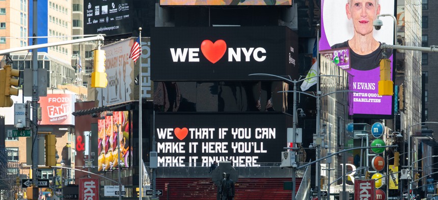
Out with the old logos, in with the emojis. Alexi Rosenfeld/Getty Images


Most New Yorkers wouldn’t be caught dead wearing an I ❤️ NY shirt. But that doesn’t mean they won’t defend Milton Glaser’s logo to the death. The We ❤️ NYC campaign, which launched March 20, was meant to get city residents to rally together coming out of the COVID-19 pandemic. They rallied all right – against the new logo, which just felt … off. Other outlets tried to fix it. City & State New York decided to embrace the chaos and make other well-known New York City logos much worse.
NEXT STORY: Striving for equity for the disability community