New York State
Lies, damned lies and COVID statistics
Understanding pandemics requires lots of data so reader beware of arguments based on a single-metric
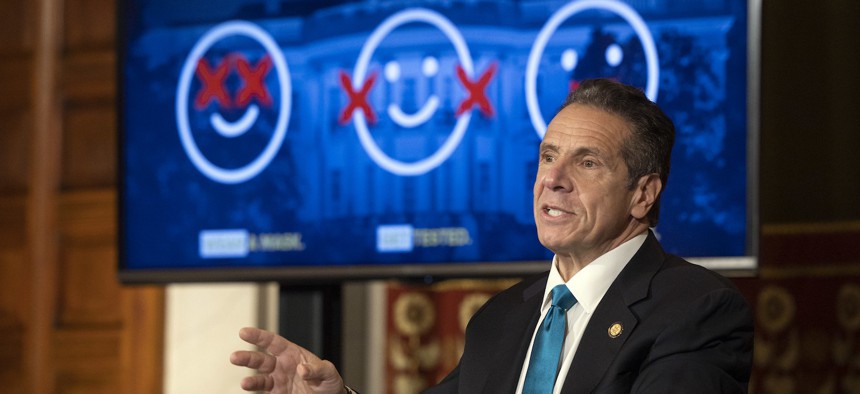
Governor Cuomo's powerpoint mocking the Federal Government's COVID response. Mike Groll/Office of Governor Andrew M. Cuomo

Just how bad is COVID-19 surging in New York? The best answer to that question has changed over time. Total confirmed cases used to be the headline data point early on in the pandemic. Then came hospitalizations and deaths. Now, two other measures are focal points: testing positivity rate and the number of new cases per 100,000 people.
“It’s not one metric that can tell you how a given area is doing during the epidemic,” Syra Madad, senior director at the System-wide Special Pathogens Program Office at NYC Health + Hospitals, said in an interview. “You have to look at multiple different factors.”
These metrics all have their own statistical biases that help tell different stories about the state of the pandemic – a useful tool for anyone looking for a rhetorical edge in arguing whether things are getting better or worse in the Empire State.
Both New York City and state regularly publish an assortment of data about the pandemic, but elected officials typically lean on a few choice metrics in their public messaging. Hospitalizations and deaths are useful, but they are lagging indicators that show the consequences of infections from days and weeks past. Real-time understanding of the pandemic largely depends on finding who has the coronavirus among the tens of thousands of people who show up every day to testing centers for whatever reason – whether out of legitimate fear of the infection or simple curiosity.
Gov. Andrew Cuomo, for example, has touted for months how the testing positivity rate – the number of reported tests that detect COVID – is much lower in New York than in other states. The 1-2% rate typically reported by the governor each day is well below the 5% threshold that health experts say is the difference between keeping the pandemic under control and beginning to see the coronavirus run amok.
Testing the positivity rate also signals whether there is enough testing being done overall. “Early in the crisis, when we were doing positivity on our tracker, I remember looking at it and seeing it was close to like 40% or 50% at one point,” Gareth Rhodes, a member of the governor’s coronavirus task force, said in an interview. “But that was at a time when testing capacity was very limited.” Eight months later, states like South Dakota now find themselves in a similar quandary as the pandemic surges to record levels nationwide.
The metric is now a key part of the state’s new “microcluster” strategy, which is designed to avoid the need to reimpose sweeping lockdowns seen in March and April. “We have invested in the infrastructure that’s actually needed to do this protracted game of ‘Whack-a-Mole,’” Madad said. “Much more preferred than massive shelter in place.” She added that the state is generally in pretty good shape as far as deadly public health emergencies go, but there are some warning signs.
The latest state data shows that several regions of the state are now reporting alarming increases in the number of new cases per 100,000. The Central New York and Mid-Hudson regions are reporting 10.06 and 11.76, respectively, on a seven-day rolling average. The Southern Tier is reporting 28.89 – quite a contrast to the 1.3% positivity rate. Residents of any state with a rate above 10 are subject to a two-week quarantine upon arrival in New York, though the governor has said that restriction will not apply to people from New Jersey, Massachusets – or individual regions of New York, for that matter.
So while testing positivity suggests all regions of the state are doing pretty well, the rising rate of new cases per 100,000 paints a much darker picture of what the coming weeks could bring, according to an analysis by the Empire Center for Public Policy. “The disconnect between the two measures appears to be driven by a significant increase in testing over the past month, much of it conducted by colleges and universities as part of their routine screening of students and staff,” Bill Hammond, a senior fellow for health policy at the center, wrote in an Oct. 27 blog post.
In other words, testing people who are disproportionately unlikely to have the virus is depressing the total positivity rate at a time when cases are rising to their highest rates relative to population since May. That is one reason why statewide hospitalizations have doubled in recent weeks, though they remain just a fraction of what they were in New York in the spring. “Low positivity rates are a sign that New York is doing enough testing to keep good track of the pandemic’s progress,” Hammond added. “But it’s also important to pay attention to the results of that testing – and they say that New York’s pandemic is currently getting worse.”
The Cuomo administration has pushed back at suggestions that it is paying too much attention to the positivity rate. “If you go on our (online) dashboards, we present all of it in terms of all these different things that each have their own uses,” Rhodes said. While new cases per 100,000 people is among the metrics used by the state, the mental math can get a little complicated. “If you look at TV on a daily basis, it’s the number of new cases, and it’s the positivity, right?” he added.
A third statistic illustrates how the realities of COVID-19 can impact otherwise objective-looking numbers. The R0 (pronounced “R-naught) measures how many people the average COVID-positive person infects. This is currently hovering just above 1 in New York, which suggests that the pandemic is growing slightly rather than shrinking. The big problem with this measure is the fact that just a small fraction of infected people cause somewhere around 80% of cases. “If Amazon’s CEO, Jeff Bezos, walks into a bar with 100 regular people in it, the average wealth in that bar suddenly exceeds $1 billion,” The Atlantic recently wrote about the pitfalls of R0.
There is a common problem with many of the statistics we currently use to assess the pandemic, according to Columbia University epidemiologist Wafaa El-Sadr. “What you want to do is ... a random sample of the population,” she said in an interview. “And then you go out and you test the selected individuals, and that way, you have a real snapshot as to who is infected.” To that end, an upcoming study by Columbia researchers will survey thousands of people in New York and more than a dozen other communities across the country for the coronavirus and its antibodies.
The study will not be a truly randomized sample because participants will be the people who happen to come by testing sites located at places like parks and shopping centers. Yet, it strikes a balance between finding solid data and getting results out relatively quickly to help scientists and policymakers. “It’s a very intricate process,” El-Sadr said about randomized studies. “You have to do a lot of preparatory kind of work to make sure that people are really eager to participate if they are selected.” That takes time and money, while a venue-based approach could get results out to the public sometime in early 2021, according to El-Sadr.
Before the study sheds new light on how the coronavirus has spread based on geography, age, race and income, COVID truth-seekers are stuck with the data at hand. A comprehensive review provides a relatively nuanced snapshot of the state of the pandemic, especially compared to the limited understanding from months ago. Yet, how the numbers are sources is arguably just as important as what they ostensibly say. “A sample study is no better than the sample it is based on,” former tobacco lobbyist Darrell Huff writes in “How To Lie With Statistics.” If casual pandemic-watchers aren’t careful, they, too, can be misled by people who have their own reasons to claim that things are better – or worse – depending on the political moment.
NEXT STORY: Candidates’ ad hoc mask approach